|
(I/ITSEC) Conference Part II
by Eric Larson, LT USN January 12th, 2000 |
||||
|
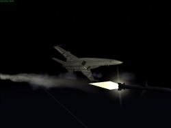
The fire is great. The screenshots do NOT do the fire rendering justice. Think volumetric GLOWING fire. Now think volumetric fire spinning, jumping up, and billowing black smoke. Its almost as if someone sat down in front of a big ole bonfire, watched it and tried to replicate that on a computer. The height of the fire actually builds up then jumps back down like real fire. Alright, I think I covered fire enough... (HEHEHEH - fire fire fire!) More on weapons. As a member of the weapons department on a carrier, I know that navy aircraft fly with ordnance fins aligned in an "x" fashion while air force usually arrange their fins in a "t" fashion (or so I was told). True to Janes reputation to attention to detail - fin configuration is faithfully modeled. Most GOTS simulations don't come anywhere near the weapons modeling found in this (or for that matter most other) simulations.
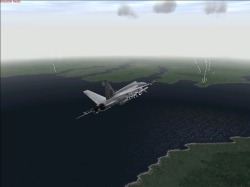
 Dynamic Lighting. This topic is being covered quite well in the various reviews we are seeing on the net. Suffice to say, it is truly impressive. Mark my words, you will want to run this sim on the largest monitor at the highest resolution on the fastest computer you can possibly afford. The graphics are just that good. Start saving now. If you've been saving - KEEP saving for more. You will not be disappointed that you took my advice. (I fully realize that your wife will probably want to choke me... :D) The sun and accompanying illumination effects are also something to comment about. As of 13 Dec while I am typing this, I haven't seen a screenshot illustrating this effect suitably, yet. If you were to go outside on a clear bluebird day and looked at the sun, you wouldn't actually SEE a yellow orb up there. You see a huge region of just white and yellow. And, yes, you do see a flash of just pure brilliant white light in the center, but you really don't spend too much time doing that! :-) Well, the surrounding brilliance of the sun is represented in this sim. Its a large region of brightness in this sim - I haven't seen anything like it before. But it doesn't stop there. If you are looking towards the sun and there are other things between you and it, you are looking at the shaded side of those things and they are consequently darker. Visibility improves when you turn away from the sun - as it does in real life. Too cool. Multiplayer. Now, of course, I couldn't experiment with MP as this was the only sim around with -18E on it, but let me tell you what I did see. MP has been weaved into this sim as an integral part of the overall experience. I mean, everywhere you turn you're presented with chat buttons, missions are designed specifically with MP in mind, etc. MP optimization has been taken seriously. Some GOTS simulations are made with networking in mind, but they are just now making important inroads into this technology. But then, when it does happen, its going to happen in a big way. Pilots have *very* little tolerance for any kind of warpage at all. I mean, they don't want to be ONE frame behind the guy in formation (imagine - in-flight refueling online - you're in South Carolina and the refueling crew is flying their simulator in Maine or California - doesn't matter, at 60 fps they don't want to see a single stutter - talk about hard customers...) Afterburners. You'll be pleased to know that the ABs light independent of each other. In other words, there seems to be a built in variability. Command the AB (from and external view) and one engine lights, then the other. Do it again and now the *other* one lights first. Do it again and this time there's a pause and *both* light. Really something else. What *didn't* these guys think of? |
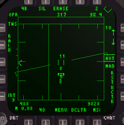
 Avionics. Because I've seen the real thang (or pretty darn close to it), I'm going to be a little harsh here. Don't get me wrong, Janes has definitely raised the bar in this area a good yard or so above everything else on the market to date, but it can get better, gentlemen. I didn't notice RWR sybology depicted on the HUD. It's not classified, another sim has already modeled it (H3 and HK) - and more recently DIs FA18. Apparently Jane's ommitted this out of concern for HUD clutter. The radar also has an additional mode not available on the Janes product: The AZ-EL display - it displays radar data in azimuth vs elevation format (vice the usual azimuth vs range fromat we are accustomed to). I was told that the normal setup in the cockpit is to have the standard display in the righthand MPD the AZ-EL display to the left.
 If this is true, the AZ-EL display isn't one of those rarely used (but modeled nonetheless) VS modes - its a regularly utilized radar mode that adds to a pilot's SA. Why isn't it modeled (and VS is?)? I think its a good question. Also, Hornet MPDs use more than one color. Janes doesn't. Cursor control is not what it should be in commercial sims. Push hard and it the cursor goes fast, push softly and it moves slowly. Why can't we have this? (You may say that there is no way for the keyboard to know how hard you are pressing. And you'd be correct. But Janes has made a key command that, while pressed, makes joystick inputs go to the cursor. A good move. And a move that would allow for proportional movement of the cursor. But, alas, I tried it and there is ONE speed for the cursor. And that right slow at that!)

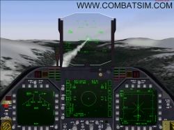
 That said, let me comment on what *was* modeled. Be prepared to be duly impressed. The level of detail is awe inspiring. And you don't need to digest the entire manual (which wasn't available at the booth) to get up and running in full-up realism mode, but then again, I could never quite get the moving map display up either! ;D The weapons arming page is fully functional (I tested it against the real thing in the Boeing sim) and its easy to understand and master. Good show. Virtual cockpit. I like it. Go to Page 6.
|
|||
|
Copyright © 1997 - 2000 COMBATSIM.COM, INC. All Rights Reserved. Last Updated January 12th, 1999 |
||||
